> ## Documentation Index
> Fetch the complete documentation index at: https://docs.rxresu.me/llms.txt
> Use this file to discover all available pages before exploring further.
# Viewing application insights
> See how far your applications get, how often and how fast people reply, whether tailored resumes do better, and export a picture of your job search pipeline.
The **Insights** view turns your applications into a few simple numbers and charts. Use it to spot where things stall, for example lots of applications but few replies, and to see whether tailoring your resume is paying off.
To open it, go to **Applications** and select the **Insights** tab. Insights counts all of your applications, including closed ones, whatever you've typed in the search field.
Insights appears once at least one application has reached **Applied**. Until then you see a short message instead.
## Read the charts
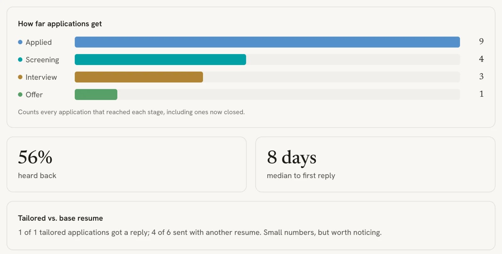 * **How far applications get**: For each stage from **Applied** to **Offer**, the number of applications that ever reached it. This uses each application's stage history, so an application that reached **Interview** and was later closed still counts for **Applied**, **Screening** and **Interview**.
* **heard back**: The share of sent applications that got a reply. A reply means the application moved on to **Screening** or later, or was closed as **Not selected**.
* **median to first reply**: The typical number of days between sending an application and that first reply. It uses the dates in each application's **Activity**, so correct those dates if you added applications after the fact.
* **Tailored vs. base resume**: Compares applications sent with a resume made for that job (with **Tailor a resume** or **Copy for a job…**) against those sent with another resume. It only counts applications with a linked resume. With fewer than 10 of those, it reminds you the numbers are small.
## The pipeline picture
**Where your applications went** draws your pipeline as a flow from **Saved** to **Offer**. The number above each bar is how many of your current, not-closed applications are at that stage or beyond, and the percentage under it is how many made it on from the stage before. The top line shows how many applications are active, with closed applications counted separately.
* **How far applications get**: For each stage from **Applied** to **Offer**, the number of applications that ever reached it. This uses each application's stage history, so an application that reached **Interview** and was later closed still counts for **Applied**, **Screening** and **Interview**.
* **heard back**: The share of sent applications that got a reply. A reply means the application moved on to **Screening** or later, or was closed as **Not selected**.
* **median to first reply**: The typical number of days between sending an application and that first reply. It uses the dates in each application's **Activity**, so correct those dates if you added applications after the fact.
* **Tailored vs. base resume**: Compares applications sent with a resume made for that job (with **Tailor a resume** or **Copy for a job…**) against those sent with another resume. It only counts applications with a linked resume. With fewer than 10 of those, it reminds you the numbers are small.
## The pipeline picture
**Where your applications went** draws your pipeline as a flow from **Saved** to **Offer**. The number above each bar is how many of your current, not-closed applications are at that stage or beyond, and the percentage under it is how many made it on from the stage before. The top line shows how many applications are active, with closed applications counted separately.
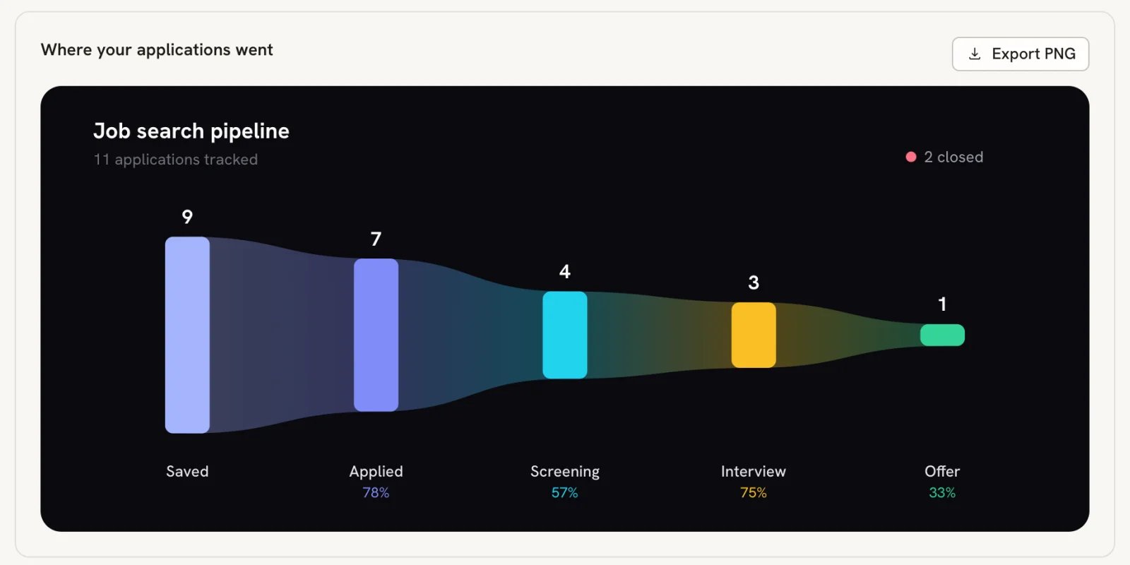 Select **Export PNG** to download the picture as `pipeline-flow.png`, a high-resolution image with a small Reactive Resume mark in the corner. It's made for sharing, for example with a mentor or career coach.
The pipeline picture counts only applications that aren't closed, while **How far applications get** includes closed
ones. That's why their numbers can differ.
## Weekly activity and sources
Select **Export PNG** to download the picture as `pipeline-flow.png`, a high-resolution image with a small Reactive Resume mark in the corner. It's made for sharing, for example with a mentor or career coach.
The pipeline picture counts only applications that aren't closed, while **How far applications get** includes closed
ones. That's why their numbers can differ.
## Weekly activity and sources
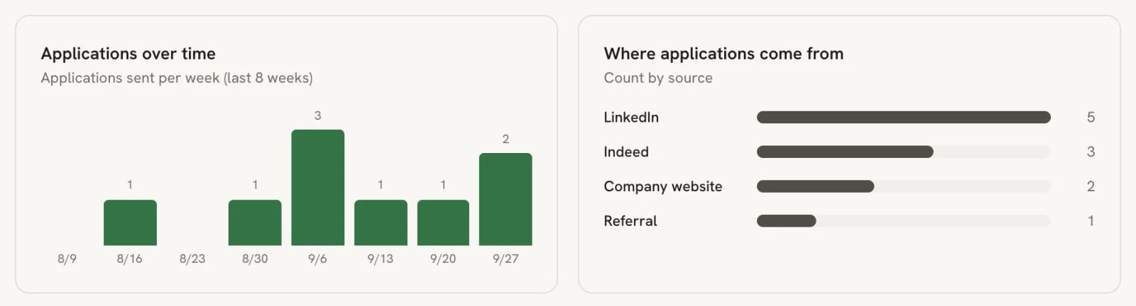 * **Applications over time**: How many applications you sent each week over the last 8 weeks, dated by their first move to **Applied** or later. Applications that later closed still count; jobs that never reached **Applied** don't.
* **Where applications come from**: How many applications have each **Source**, such as LinkedIn or Referral. Fill in the source on each application to make this useful. Applications without a source aren't shown.
## Related guides
* [Managing an application](/guides/managing-an-application): fix stage dates and sources so the numbers are right.
* [Tailoring a resume for a job](/guides/tailoring-a-resume-for-a-job): make tailored copies to compare against your base resume.
* [Tracking job applications](/guides/tracking-job-applications): the other views.
This documentation is built and hosted on [Mintlify](https://mintlify.com), a developer documentation platform.
* **Applications over time**: How many applications you sent each week over the last 8 weeks, dated by their first move to **Applied** or later. Applications that later closed still count; jobs that never reached **Applied** don't.
* **Where applications come from**: How many applications have each **Source**, such as LinkedIn or Referral. Fill in the source on each application to make this useful. Applications without a source aren't shown.
## Related guides
* [Managing an application](/guides/managing-an-application): fix stage dates and sources so the numbers are right.
* [Tailoring a resume for a job](/guides/tailoring-a-resume-for-a-job): make tailored copies to compare against your base resume.
* [Tracking job applications](/guides/tracking-job-applications): the other views.
This documentation is built and hosted on [Mintlify](https://mintlify.com), a developer documentation platform.