Quick fixes
Here are several ways to fit your content within a page, ordered from simplest to most involved.1. Switch to Free-Form format
If you don’t plan on printing your resume, the simplest solution is to switch to Free-Form format. Free-Form creates a single continuous page with no height limit, eliminating overflow concerns entirely. With Free-Form:- Your entire resume renders as one seamless document
- No awkward page breaks to manage
- ATS parsers and AI scanners can still read your content perfectly
- You focus on content, not arbitrary page constraints
2. Shorten text blocks
Long paragraphs take up space without adding proportional value. Review each section and cut ruthlessly:- Use bullet points instead of paragraphs. Bullets are easier to scan and take less vertical space.
- Remove filler words. “Was responsible for managing” becomes “Managed.”
- Focus on impact. Keep measurable achievements; cut generic descriptions.
- Limit bullets per entry. Three to five bullets per job is usually enough.
3. Use multi-column layouts
Some sections work better in multiple columns, especially lists of short items. In the left sidebar, find the section you want to adjust, click on the section heading (not an item), and change the Columns setting.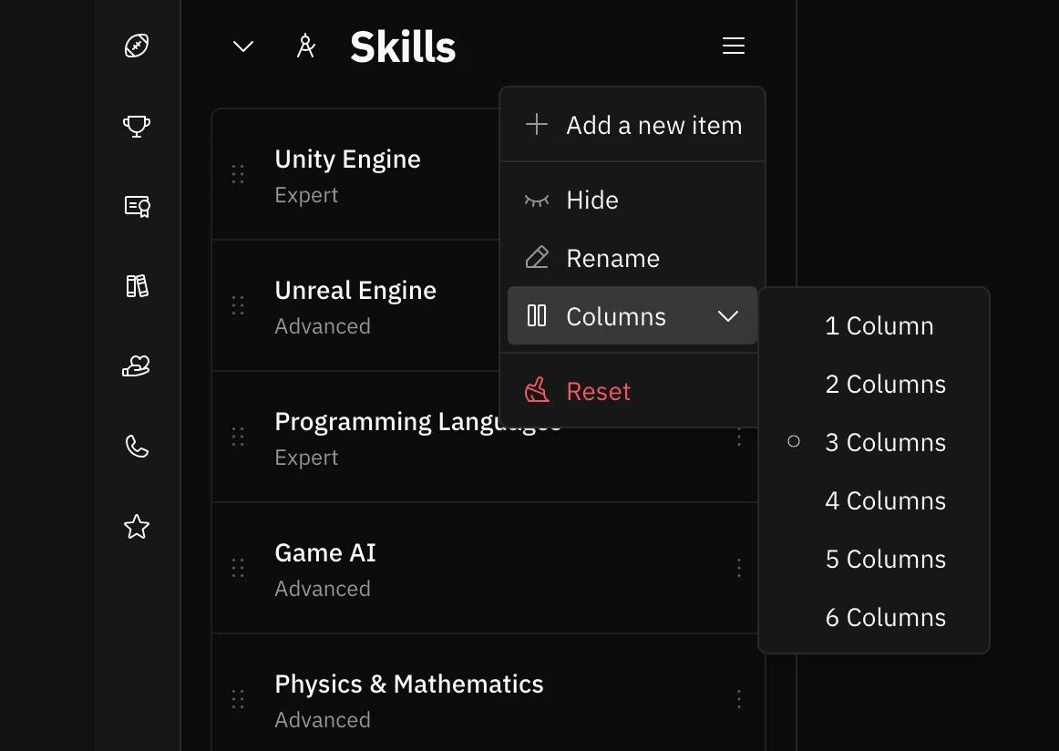
| Section | Recommended Columns |
|---|---|
| Skills | > 2 columns |
| Languages | > 3 columns |
| Interests | > 2 columns |
| Profiles | > 3 columns |
| Certifications (if brief) | > 2 columns |
Multi-column layouts work best for sections with short, uniform items. Sections with long descriptions (like
Experience or Projects) usually work better in a single column.
4. Move items to another page
If you have more content than fits on one page, move less important items to page two. This keeps your first page focused on your most relevant experience. Use the Move to feature to relocate items:- Open the item’s dropdown menu (three-dot icon)
- Hover over Move to
- Select the destination page
5. Adjust layout and design settings
The right sidebar contains settings that control how much space your content uses. Small adjustments here can make a big difference. Open the right sidebar and explore these options:| Setting | Where to find it | Effect |
|---|---|---|
| Font size | Typography | Smaller fonts fit more text per line and per page |
| Line height | Typography | Tighter line spacing reduces vertical space |
| Margins | Page | Smaller margins give you more usable area |
| Section gaps | Page | Reducing gaps between sections saves space |
| Sidebar width | Layout | Adjusting the sidebar ratio can balance content better |
| Picture size | Picture (left sidebar) | A smaller photo leaves more room for text |
Reducing font size is the best option when you need to fit more content while keeping A4 or Letter format.
Reducing body font from 11pt to 10.5pt (or even 10pt) can free up significant space while remaining readable. The
editor supports 0.1pt increments, so you can fine-tune precisely.
6. Hide less important sections
If you’re still short on space, consider hiding sections that aren’t essential for your target role:- Interests — Nice to have, but rarely a deciding factor
- References — “Available upon request” is assumed; you don’t need to list them
- Older certifications — Keep only those relevant to the job
- Volunteer work — Include only if it strengthens your application
Finding the right balance
If you need to stick with A4 or Letter format, start with content changes (steps 2-4) before adjusting design settings (steps 5-6). The best resumes fit their content naturally rather than forcing everything into a cramped layout. Try this order:- Consider switching to Free-Form if printing isn’t required
- Cut unnecessary text first
- Reorganize with columns where appropriate
- Move secondary content to page two if needed
- Fine-tune font size and spacing last
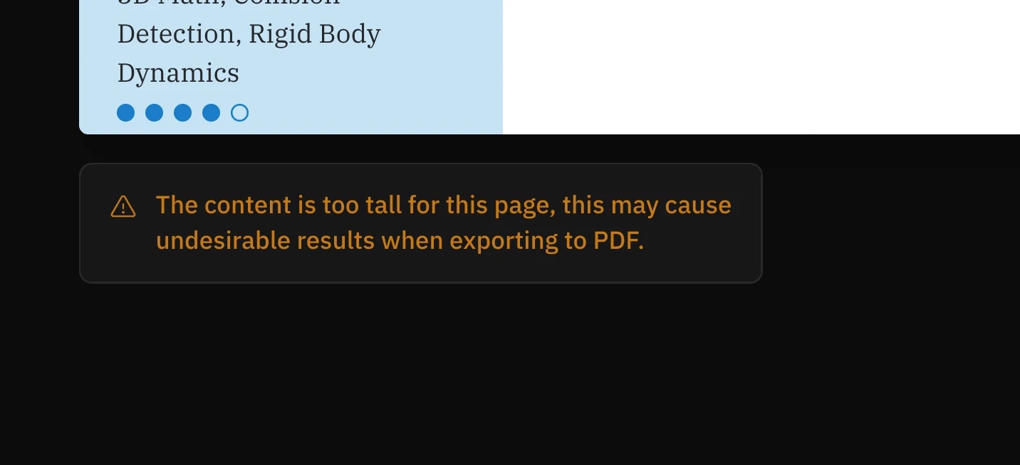
Troubleshooting
Content still overflows after trying everything
If you’ve tried all the above and content still overflows:- Re-evaluate what’s essential. Every item should earn its place. Cut aggressively.
- Try a different template. Some templates are more space-efficient than others.
The preview looks different from the PDF
The PDF export matches the preview exactly. If they appear different, try:- Refreshing the page
- Checking that all fonts have loaded
- Ensuring your browser zoom is at 100%