

Pick an accent color
1
Open Color
In the editor, select Design (or press 2), then select Color in the row of links at the top of
the panel.
2
Choose a swatch
Select one of the eight swatches: Moss, Ink blue, Teal, Plum, Rust, Burgundy, Ochre or Graphite. Hover over a swatch
to see its name. All eight are dark enough to read on white.
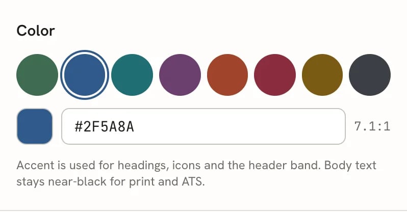
The Color group with Ink blue selected and its contrast ratio
Use your own color
Type a six-digit hex code, such as#1F6E73, in the field under the swatches. The # is optional. The page updates as soon as the code is complete, and the square on the left shows the color.
Next to the field is the color’s contrast ratio against white. Headings need at least 4.5:1 to read comfortably. Below that, the ratio turns amber and a warning appears:
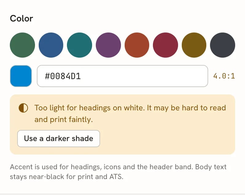
A light blue accent triggers the contrast warning
Change text and background colors
The Color group only sets the accent. For the other colors, open Advanced at the bottom of the Design panel and find its Design section:- The row of 22 swatches sets the accent (primary) color. These include bright colors that may not pass the contrast check.
- Primary Color is the accent.
- Text Color is the color of body text.
- Background Color is the page color.
rgba(47, 90, 138, 1). Use the picker, or type a new value in the same form.
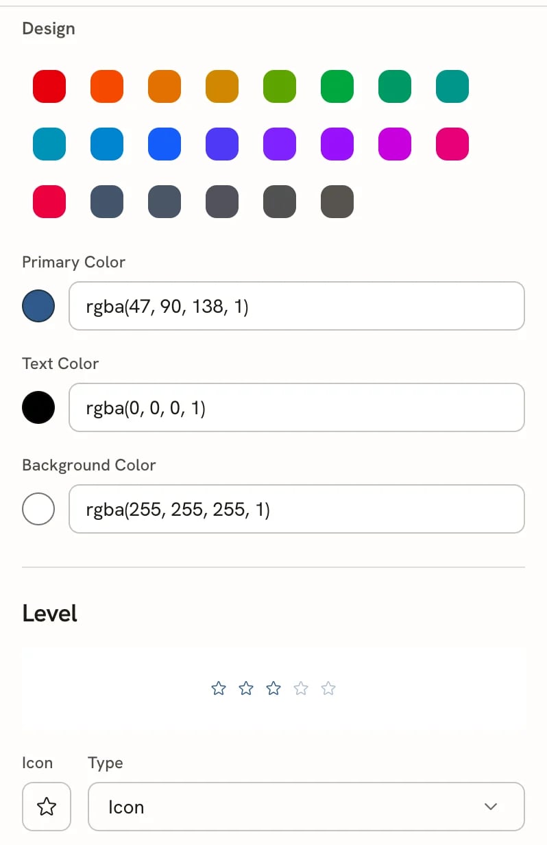
Advanced → Design: color fields and the Level style
Change how skill levels look
Skills and languages can show a level, for example 4 out of 5. Under Level in Advanced → Design, choose how every level on your resume is drawn. The preview above the controls shows level 3 in your accent color.
You set each entry’s level while writing it; see Editing entries.
Cover letters have the same Color controls in their own Design mode. See Writing a cover
letter.
Related guides
- Customizing typography: fonts, size and density.
- Choosing a template: templates decide where the accent appears.
- Checking your resume: find readability issues before you apply.